ShopDreamUp AI ArtDreamUp
Deviation Actions


Suggested Deviants


Suggested Collections


You Might Like…


Featured in Groups


Comments79
Join the community to add your comment. Already a deviant? Log In
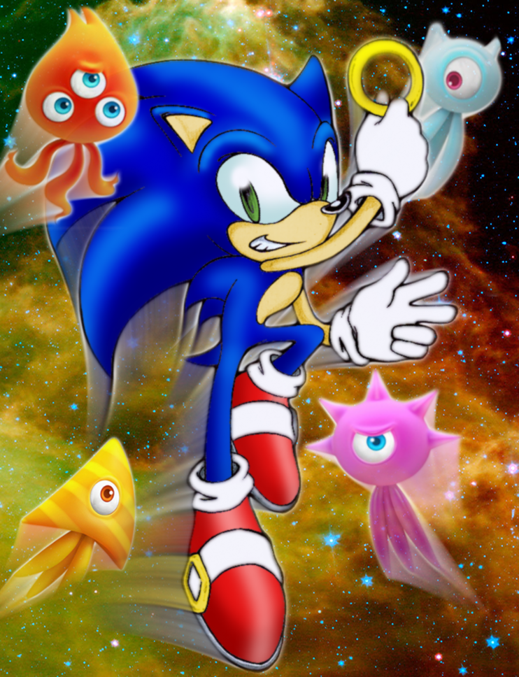
It's easy to see what inspired this picture, and it's a good scene for inspiration at that -- the very last bit at the opening of Sonic Colours where everyone leaps up in slow motion leaving behind trails of light behind them. You get a nod for vision; that scene can be reinterpreted and done very nicely.
Beyond that....
1. General. The Wisps are official renders, Sonic is drawn, and that completely gashes the look and feel the piece could have given. Now I understand it'll be difficult to make Sonic look like a full-blown 3D render just from scratch, but if you're going to sketch one character, please have all the others sketched too. The trails behind Sonic and the Wisps are pretty well done, but they look awfully disparate, especially when Sonic is outlined and the rest aren't.
2. Colour choice and background. There's a reason why the opening scene (with all its trails) was done in a dark (blue) background: a dark background brings out the colours of Sonic and the wisps.
Now I believe that this was to bring out the warm colours of the Wisps here (please correct me if I'm wrong), but they still clash. Sonic is dark blue; the background is orange-yellow, and the background doesn't complement him. Neither does it complement the Pink, Red and White Wisps. However, the placement of the Yellow Wisp was awesome: the yellow stands out very well against the green.
3. Colouring technique. I must give you kudos for how smoothly you coloured Sonic. I don't see very many visible smudge lines. <img src="e.deviantart.net/emoticons/s/s…" width="15" height="15" alt="
On the whole: Excellent concept, good colouration of Sonic, good work with the trails. Need work with background, colour choice and giving Sonic a place of prominence in the picture. And it'll reflect your artistic skill far better if you drew those Wisps, rather than if you used official renders.
Keep drawing, I say! <img src="e.deviantart.net/emoticons/s/s…" width="15" height="15" alt="